How to Design a Banner for Your Business. Our Design Tips to Make a Perfect Banner!
If you’re wondering how to design a banner from scratch, you’ve come to the right place. By following our step-by-step guide, you’ll learn how to choose the right custom banner and create an eye-catching design that grabs the attention of potential customers.
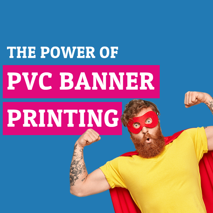
Tip: Curious about why banners are still so impactful? Master the power of banner printing and see why it remains a top marketing strategy.
How to Design a Banner of Your Choice!
Before diving into the “how,” let’s cover the basics. A banner is a printed marketing tool used to promote your business and build brand awareness. Thanks to their size, banners are perfect for drawing the attention of passers-by. They come in a variety of materials—vinyl, mesh, fabric, and more—and while we won’t explore every type of banner in depth here, the design principles remain the same no matter which one you choose.
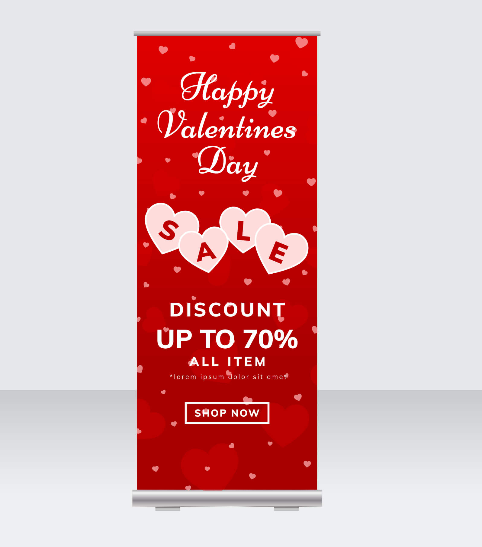
If you’re specifically interested in retractable stands for events, you might also learn how to design a roller banner for maximum portability and impact.
Choose the Right Placement of Your Banner!
Location, Location, Location! Think about where you want to place your banner. This will help you select the right size and type of banner for what you want to say and where! Knowing the size of the banner as well as the type before you start making any kind of banner design is crucial and is probably the most important part of the design process.
Explore banner design ideas that complement posters to ensure you select the perfect type and placement for maximum impact.
For example, you wouldn’t choose a roller banner stand for a long-term external display, yet they are perfect as indoor retractable banners.
Sizing down to some graphic design tips!
Think About the Main Message When You Create a Banner.
You will want to make sure they’re seen and stand out – you wouldn’t want them to blend in with the background. Unless, of course, that’s the look you are going for! Most people who order printed banners want their banner to stand out, whether that’s to increase brand awareness or give out key information.
Discover how commercial printing benefits apply to banners and can lift your designs to new heights.
In the same way, think about the wording you want to use on the banner. What do you want those who read it when it grabs their attention from a distance to do? Buy something? Go somewhere? Thinking about this will help you get straight to the point – this is what’s known as a call to action or CTA. To make an eco-friendly impact, consider how sustainable materials and practices can align with your message.
If you want to make a sustainable impact, consider using eco-friendly banners and highlight your commitment to the environment in the design itself. Depending on where you have chosen to use your banner can impact the time your banner has to make an impact.
Think about other things that need to be on the design, such as social icons, a web address, and your company logo.
Choose Your Fonts Wisely and Think About Readability!
When you begin to make your own banner from scratch, your message must be easy-to-read and legible. The typeface of the font you choose can help people understand your message quickly, as not everyone has time to stop and read. Knowing this will help you bear typography in mind, and you can use different fonts to help you create a hierarchy within the design.
Typically, an eye-catching message is printed in a large font – something to create a reaction and help them see the banner from a distance. Smaller font sizes are great for supporting information such as website addresses and marketing copy.
Here are Some Good Font Recommendations for Banner Design:
- Arial – highly legible, especially from a distance. The simple, clean letterforms make it very versatile.
- Helvetica has a professional, modern look that works well for many banner designs.
- Impact – A bold and attention-grabbing, perfect for headlines and short impactful phrases on a banner.
- Bebas Neue – has a distinct look with solid, blocky letterforms that are easily readable on banners. Great for titles.
- Open Sans – works well for both headlines and blocks of text.
- Montserrat – subtle, rounded letterforms give it a warm, welcoming feel. Works great for approachable, inviting messages.
- Oswald has a bold, high-impact look that can add drama to banner headlines and titles.
| Headline | Body Text |
| Bebas Neue | Open Sans |
| Impact | Helvetica |
| Oswald | Lato |
| Montserrat | Roboto |
Some Tips for Pairings:
- Pair a bolder, eye-catching font for headlines with a more readable body text.
- Combine a sans-serif header font with a serif body font for contrast.
- Make sure thickness weights are sufficiently different (don’t pair two super bold styles).
- Consider both formal and informal combinations to fit the brand style.
- Limit to 2-3 maximum for a clean, consistent look.
In general, focus on simple fonts with clean lines and a strong visual presence. Avoid highly stylised or cursive styles that could be difficult to read on a banner viewed from a distance.
Think about other supporting design elements you need to include when you design your banner.
Our Next Design Tip is to use Colours to Attract Attention!
Using colours correctly within your design can help you spread your message. Nearly as important as where you plan to hang your message! For example, think about Valentine’s Day banners – you naturally would expect a design using red, or a Black Friday banner commonly seen with Black and Yellow.
This is what is known as colour psychology – For example, red commands attention, blue conveys trust, and yellow is energetic. Pick colours that align with your message and brand.
Where you are putting your banner will also depict the colours you could choose, which is why that was near the top in our tips to create a banner design.
Contrasting and striking colours help create hierarchy in the same way that the right fonts do. Think about black words on a white background; it can help draw the eyes and create a sleek look.
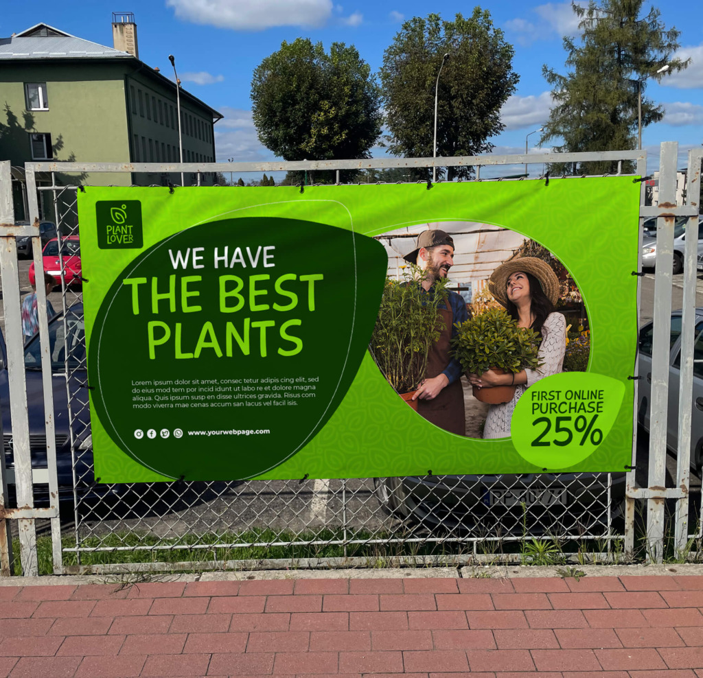
Create Visual Narratives with Images or Graphics
Use images to create a focal point and convey your message. A picture can speak a thousand words – not poor-quality images, though. Think about what it is you are trying to say, and use an image that highlights what you are saying! There are plenty of free online image sources, such as Unsplash, for example. If you are using images, high quality is a must!
We would always recommend the use of jpegs with a minimum of 300 dpi to ensure a great banner! Using an image of low resolution will negatively impact the design of your banner. We know it’s the perfect image and looks great on screen – remember you’re designing a large format design. The higher-quality image you use from the start will ensure that your banner looks and performs great.
Fun Fact: Want to learn more about how different banners can suit different colour schemes or branding goals? Check out our guide to the different types of banners to see which might fit your next campaign best.
Logos, etc., are typically best added in vector format. This is a scalable format that does not lose quality when resized!
There are plenty of places to get free banner stock photos, helping your design look crisp!
Pro Tip – Don’t overcrowd the design with too much text – let it breathe! This is what is known as white space within the design (no, it does not mean white only)
Review Your Final Design.
Does your design convey your message quickly? Take a break, step away for a while – come back and check again. Does it tie in with your other marketing content, such as flyers? Review all text for spelling mistakes, and when you are happy with your design, get in touch, and we will be more than happy to print it for you!
So we have covered the design part of how to make a banner.
Software to Make a Banner.
When we design banners, we use professional software such as Adobe Photoshop and Illustrator; we would classify these as the right tools for the job. Banners are typically large format, and as such, you would want the ability to scale and resize elements without a loss of quality.
When you design your banner, we would recommend that you design it at the right size. This will ensure the quality of your banner is as good as what you see on screen. We see it a lot where people design banners in Word or Publisher, and they look great on screen. We are going to be straight with you – so just don’t do it!
It is always a good idea to check with your chosen banner printing company whether the files you are going to supply are going to be suitable. This can save you time regarding starting the design of your banner in the right program.
Some online banner makers offer design templates – just make sure they are printed banners and not web banners, as there is a difference. Make sure that you can download the available templates in a format suitable for what you’re having printed. Find a design that speaks to your banner’s vision, and you will want to customise it to your needs.
Our Design Pre-Print Checklist!
Here is our short checklist of things to review before submitting banner files for printing:
- Image Resolution – Confirm all images are high resolution (300 dpi recommended) and crisp when viewed at full size. Pixelated images will print poorly.
- Format – Save files as print-ready PDFs or high-quality JPEGs. Avoid file types like Word docs.
- Size – Double-check that it is designed at the correct dimensions needed for printing.
- Bleed – Banners need bleed for installation and safe zones for the eyelets.
- Fonts – Embed or outline fonts to avoid issues of missing fonts at printing.
- Proofread – Triple-check for any text or layout errors before sending final files.
- Branding – Ensure logos, messaging, and colours are on brand and correct.
Following this checklist helps avoid common file issues that can delay printing and ensure your banner files are ready for production.