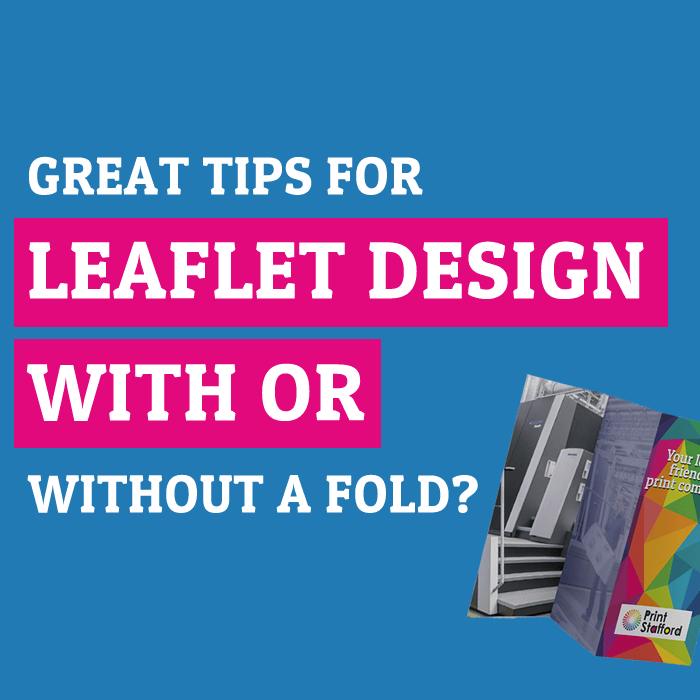
Our Ultimate Guide to Creating an Eye-Catching Flyer Design
Leaflets and flyers are still great promotional tools when you create an attention-grabbing design, and we’re going to go through some tips on how to make the perfect flyer.
Creating an eye-catching flyer that is not only informative but also has a great design is key to attracting potential customers to learn more about who you are and what you offer.
With the help of our ultimate beginners’ guide, you will go through a list of tricks to create an eye-catching design that will help ensure you stand out for the right reasons. Explore how commercial printing benefits can enhance your flyer design and enhance print quality.
Define the Flyer’s Purpose: Is it an Event Flyer or Other Promotional Flyer?
Clearly understand the purpose and what message you want to convey through the flyer. Put simply, it’s what you want your flyers to do. Perhaps you are a band designing your flyer for your next event, or you could be a business looking to create another type of flyer. To design a well-designed flyer, it’s important to always keep this in mind: the purpose.
Explore how commercial printing can make your flyer stand out and achieve its purpose.
This is one of the most important flyer design tips – we have seen designs where customers’ flyers don’t follow this rule.
You should always give your flyer a read-over to ensure that you are staying true to the original purpose when you design a flyer.
Understand Your Target Audience for the Perfect Flyer
This is crucial when you begin designing an eye-catching flyer because it allows you to tailor the design, content, and messaging to meet the specific needs of the people you are trying to reach.
If you keep this in mind when you create your flyer, it allows you to tailor the content so that it captures their attention and makes them read your flyer. We don’t just mean the wording, but the language and tone you use can help you set the scene. For more tips on consistency and branding, read our guide on the importance of brand identity.
For example, whether you wish the information to come across as formal, informal, professional, or casual. Different audiences will react in different ways to the way something looks, and you can use this visual appeal to your advantage – you should keep this in mind.
Prioritising how the information is laid out within the design is important when you begin to make a flyer design. Using headings and fonts that fall in line with your message, with a clear Call to Action (CTA), will help you motivate them and encourage them to take the desired action.
By understanding your audience, you increase the likelihood that your flyer will resonate with the right people, resulting in a more successful and impactful communication campaign. Remember, this is what you want when you use flyers to promote your services, products, or events!
What Makes a Business Flyer Eye Catching?
When creating flyers, it’s not just about bright colours and imagery. Sure, it plays a part, but it’s not all there is. It is a mix of key elements like compelling graphics, fonts, and complementary colours that make your flyer stand out from the crowd.
A professional flyer, whether it’s a Valentine’s Day flyer, product flyer, festival flyer, or any other type of eye-catching flyer, should not miss these fine details.
Use Compelling Headlines on Your Flyer Design!
Headlines make your flyer more interesting! When you craft a catchy headline, it immediately grabs the readers’ attention, generating interest and curiosity and making them want to read more. They allow them to quickly ascertain what it is you are promoting, along with helping divide the flyer into sections. Using headlines in this way makes the flyer more visually appealing and easier to navigate, guiding readers through the most important information first.
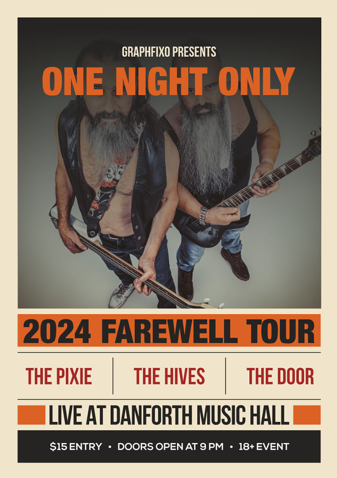
For example, a flyer promoting a band’s upcoming concert could use a large, bold headline like ‘One Night Only – 2024 Farewell Tour!’ at the top to immediately capture attention.
The key is to choose complementary font pairings with contrast – such as a clear, readable body text font with a more eye-catching display font for headlines. Avoid overly decorative fonts and stick with easy-to-read options.
Once you’ve selected the right fonts for impact, the next key step is…
Include Branded Elements for a Well-designed Flyer
When it comes to flyer design, incorporating branding elements into your design is important for instant brand recognition. If you’re using flyers as part of a broader marketing strategy (and you really should be), maintaining consistent branding across various channels (flyers, social media, website, etc.) reinforces your brand identity.
Including consistent branding elements such as logos, colours, and fonts lends a sense of professionalism to your flyer. Helping to build a sense of trust and familiarity.
Embrace Whitespace or Empty Space within the Design
No, we don’t mean just white. Space within a design is one of the best tricks for creating eye-catching flyers. Embrace whitespace to prevent visual clutter. A clean and well-organised layout enhances readability and allows the design to breathe. Want to perfect your layout? Read our guide on how to make your leaflet design stand out.
Whitespace also contributes to a modern and sophisticated look. Some might say a more elegant design. This is something that should not be overlooked when you begin to make a flyer for your business.
Consider Flyer Size
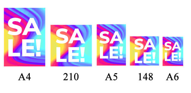
The best flyer size for your message is decided once you know the message and information that you want to include in the design, including images, fonts, etc. You should make an assessment to see how much space you are going to need for your business flyer. For example, an A5 flyer is a great size (one of the most popular choices for flyers), but if you need to display a smaller amount of information, then you could use a smaller flyer, such as an A6.
All of our products have blank flyer templates that you can use for your graphic design journey. Simply go to your chosen size and download the flyer template; they are all set up with the correct bleed and safety margins to ensure your flyers are designed and ready for print.
By paying attention to these details and tailoring your design to your audience, you can create a flyer that not only attracts attention but also drives engagement. Pick a size that fits your purpose.
Our Most Common Flyer Sizes
There is no right or wrong when it comes to size, as it is really dependent on what you are using them for, how much information you have to display comfortably, etc.
Below is a list of some of our most common Flat Flyers and Leaflets!
| Size | Size in Millimetres | Size in Inches |
|---|---|---|
| A4 | 210 mm × 297 mm | 8.3 Inches × 11.7 Inches |
| 210mm Square | 210 mm × 210 mm | 8.3 Inches × 8.3 Inches |
| A5 | 148 mm × 210 mm | 5.8 Inches × 8.3 Inches |
| 148mm Square | 148 mm × 148 mm | 5.8 Inches × 5.8 Inches |
| A6 | 105 mm × 148 mm | 4.1 Inches × 5.8 Inches |
Our Tips for Designing Eye Catching Flyers!
We will do them as questions so that you can use them to create your design brief!
What’s the purpose? To sell more products, highlight a promotion, etc.
Who is the target audience? Have we got the right imagery and branding together?
How much space do you need? How much information and imagery do you have that needs to be included within the design? Have we thought about headings and CTA’s to ensure quick and easy information sharing?
It can be as simple sometimes as the basics of WHO, WHAT, WHERE, WHEN, and HOW!
By following these essential flyer design tips focused on purpose, audience, visuals, and branding, you’ll be on your way to creating stunning designs, whether you’re designing an event flyer, a promotional flyer, or are looking to design flyers for something else entirely. If you are still struggling and wish to make sure that your flyer stands out by using our flyer design services, then simply get in touch – we would love to help!