How to Design a Roller Banner - Our Top Tips
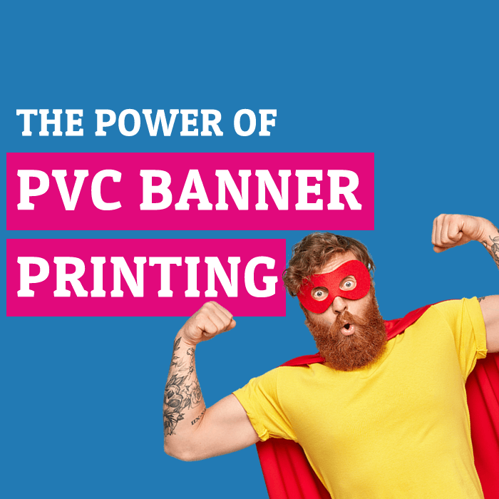
Roller banners (also known as pull-up or retractable banners) are vertical promotional displays often used at trade shows, events, or even within your own premises. The power of banner printing is hard to ignore, and these easy-to-set-up, portable stands are a perfect tool to showcase your brand alongside other marketing materials—grabbing the attention of anyone passing by!
In this article, we will explore the key aspects of roller banner design and provide expert tips for designing the best roller banner stand and help you get your message across to your target audience. When you are finished reading, you will be able to use these valuable marketing tools to best represent your product or service.
Our top tips on how to design a Roller Banner!
When you design your own roller banner, several crucial elements come into play, including size, messaging, colour scheme, images, and typography. If you’d like broader guidance on banner design, see our general how to Design a banner guide, which offers tips that can also apply to roller banners.
Choose a Location and Size.
Before you begin designing, decide where your roller banner will go and what size you need. We offer 7 different sizes, with common widths like 800mm or 850mm and a standard height of around 2000mm. If you’re using more than one banner, or you anticipate the bottom might be partially hidden by furniture or displays, plan your design accordingly—placing crucial elements higher up.
Tip: If you’re exploring other banner options, check out our guide to the different types of banners to see if a roller banner is truly the best fit.
Think About Your Message – What’s the Main Message?
Is it a promo like “25% Off Everything”? Or a headline such as “Experience Easy Accounting”? Defining your main message early ensures your banner resonates with your target audience. Don’t forget to include a high-resolution version of your logo, or simply your business name if you don’t have a formal logo.
If you want to promote an eco-friendly approach in your design or materials, be sure to check out our eco-friendly banners for PVC-free printing options.
Colours and Images on Roller Banner Designs!
Choosing the right colour scheme is essential as it sets the tone for the entire banner. Use colours that align with and complement your business’s identity and evoke the desired emotions in the viewer, ultimately attracting their attention.
We wrote about Colour Psychology and how it works in design. Ideally, this should fall in line with all your other marketing collateral, such as your Brochures or Business Cards. Don’t be afraid to use contrasting colours to create a vivid design! Likewise, you may want to convey a calming message; it’s all about setting the tone!
Roller Banners should be designed in CMYK and not RGB, the same as most things in print.
Use images to support your message. We have said it once, and we will say it again, a picture speaks 1000 words! There are plenty of places to get either paid or free to use high-quality imagery to support your message. Here are a few places to get you started.
| Paid Image Sites | Free Image Sites |
| Shutterstock | Pexels |
| Adobe Stock | Pixabay |
| Dreamstime | Freepik |
When you find the right image, ensure it’s suitable for your chosen size! For print, you will want an image that is a minimum of 300 dpi, as that is what should be used for commercial printing. When you’re using your log,o try to use a vector format – if possible, as this is scalable, ensuring it looks sharp and crisp no matter the size.
The last thing you should want is a pixelated image that looks great on screen, making that first impression not go the way you want!
Choosing the right image can help make or break your design. They can help catch people’s attention, and their ability to cut down on the amount of text needed does help!
Incorporate eco-friendly practices in your roller banner design.
Speaking of text that moves us onto the next section – typography!
Fonts! What is that we hear, you ask?
Fonts and their styles! Using the right fonts within your graphic design is something that should not be missed at any time, not just when you make your roller banner design. It is one of the most important design tips, full stop. They should be easy to read and perfect for sharing all important contact information.
Can’t we just make it bigger? Yes, the font size can help, but some can still be hard to read – trust us, we have a lot of them! You want to make sure you choose a typeface that is readable, clean and concise, ensuring your customers will want to come over and have a look when they have read it from afar!
| Font | Why It’s Good for Banners |
|---|---|
| Arial | Very readable from a distance. Clean and simple. |
| Helvetica | Modern and professional looking. |
| Futura | Simple, geometric sans serif. Eye-catching and clear to read. |
| Rockwell | Grabs attention. Has a strong visual impact. |
| Bebas Neue | Bold, geometric style. Makes a statement. |
| Lato | Clean and modern style provides clarity and easy readability. |
| Open Sans | Highly legible and works well in bold/headings. |
| Montserrat | Nice balance of formality and friendliness for approachability. |
| Oswald | Bold, heavy sans serif that commands attention from a distance. |
| Raleway | Elegant sans serif with a modern vibe. Looks upscale and stylish. |
Pro tip: We recommend 2-3 fonts maximum so the design doesn’t look too busy. Combining a headline font with a body text font works well.
Design tips for designing the best banner stand!
Ok, so you have chosen your size, got your message, know where it is going (exhibition or trade show), chosen your colour scheme and got the high-quality images you are going to use! That’s all the preparation done – on to creating that eye-catching design. How should you lay out the design?
Let’s think about how we read a leaflet or brochure. We read from top to bottom and left to right. It is no different with retractable banners. When you keep this in mind, it helps you know the positions and placements of that important information!
Typically, you will want your brand’s logo at the top, and design permitting your tagline! Having this crucial element in the top third is the perfect way to increase your brand awareness.
In the middle, you would want your key message or call to action perfectly placed to get your message at eye level with your potential customers! Think about what you want them to do!
At the bottom of most pull-up banners are the all-important contact details! This should not be overlooked, as it is how your customers can get in touch.
That’s all our key information on how to design a roller banner. They remain one of the most cost-effective displays around, lightweight and portable too! Ready to create an eye-catching roller banner? Download our handy design template to get started.